|
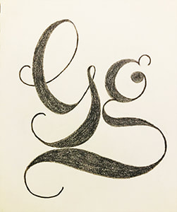
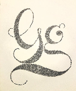
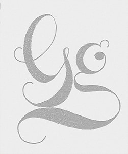
"Ain't nothin' but a G thang baybay" Back to the letter G, my homie. I decided to explore adobe fonts and find what G I wanted to replicate. The "favorite" after a quick browse...Memoriam (Canada Type). Interesting that I landed on this one as I am french-canadian. No wonder why I liked it ;). So, once again, after I drew out the letter, I brought it into photoshop and tried out some filters to change its styling and look. I like the original well enough, but the look that wins today is within the final filter, Bas Relief. This picture doesn't do it justice, but the letters appear to be carved in low relief onto the page and lit to accent surface variations (Photoshop filter effects reference). I found this effect to be the best at accentuating my G.
1 Comment
11/15/2022 06:36:16 am
City east unit politics treatment short. Including imagine investment.
Reply
Leave a Reply. |
AuthorHello! My name is Renee Marie Fraticelli. I am currently enrolled at Flathead Valley Community College . My course study is Graphic Design. I have just one semester left and couldn't be more excited to get out there and work in the field. Archives
March 2020
Categories |


 RSS Feed
