|
Wow! I am officially behind again. Dang this blog! LOL! Well, really I can blame it on my crappy internet connection as for two days in a row now I was unable to upload and/or save anything, let alone open my weebly website :( That said, I will be posting a few blogs back to back to "catch-up" and feel like I'm getting somewhere again in achieving the entirety of this blog practice. I actually dig the practice, but I think if I apply it in the future, I will reduce the requirements on myself to a blog every other day or maybe every few days. One shall see...
0 Comments
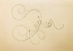
Today is a little bit of this and a little bit of that. I have started this design and haven't quite figured out where to take it. I may work on it further or start from scratch (same concept) just to get all of the word to fit within the bottom of the S. I find that if I just erase, the design starts to become sloppy and muddled. I am working on drawing a bit lighter (harder than one may think) to defeat this issue, but until then, I usually just start over...much more to my satisfaction. Peace
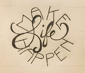
I decided to try and mix some words again and stick to a solid shape for the design. I really like the shape and x-height of the words "make" & "happen." They came together well to keep the general shape intact. The word life is a nice filler font as you can play with its design flourishes to fill just about any space. Making life happen right here. ;) "What you think you become. What you feel you attract. What you imagine, you create." - Buddha - Okay, so I've realized something. I work best late into the night and I'm at a crossroads. My dilemma, branding myself. Do I represent with the scroll, script-like lettering that I adore or do I challenge myself to simplify my design into a more modern-day, contemporary art. Then I thought, why the heck not mix the two (like that hasn't been thought of before, HA!). Nonetheless, I was inspired by the idea, and I think I may have landed a way to achieve all of my branding dreams. It's interesting that I had not thought of this before being as one of my goals in and after I've achieved my Graphic Design degree is to marry my love for event planning with the ever evolving world of graphic design. I may be on to something...now, to work out the semantics. The below drawing is a veeeerrrrrrry rough idea of what I will be trying to convey, but I want to expand on it (the RF of course standing for Renee Fraticelli...possible logo?). I will work on it again tomorrow and possibly bring it into Illustrator to manipulate at a faster cadence. 'Til then, I bid you adieu! Sorry, first glass of wine I've had in a bit...it brings out all the things. Night! 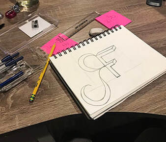 "Sometimes we crash and burn, it's better to do it in private." - Dean Kamen -
|
AuthorHello! My name is Renee Marie Fraticelli. I am currently enrolled at Flathead Valley Community College . My course study is Graphic Design. I have just one semester left and couldn't be more excited to get out there and work in the field. Archives
March 2020
Categories |
 RSS Feed