|
"Find a rhythm with your words." Today I wanted to begin the process of melding words together with a fun design. It's interesting that when you start a process like this you never truly know where it may lead to.
0 Comments
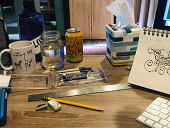
"Inspiration comes in many forms." Today I decided to begin working on a "look" that I feel represents me and my brand. I began by diving into an exercise my class mates and I had performed yesterday and really took a look at what I had written down and asked myself "what did it truly mean?" Well, to start, the first three words of my values were...Honesty, Inclusivity & Humor...then I think I was really hungry because my focus turned to doughnuts, but then I recalibrated and found that upon my reflection of just those few things I was able to begin to understand exactly who I am, doughnut distraction and all. So, what does this mean in the world of hand-lettering and how do I create something from those seemingly very different values? Here's what I came up with: 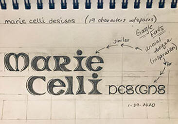 "Thank You!" Google Fonts & Designer, Astigmatic "Your font gets me and I was clearly inspired by it." Good thing it's not just a picture of me counting doughnuts to fall asleep, but oddly enough, the roundedness in the letters definitely makes me think of doughnuts...as I examine the design more, I can surely see Honesty in the subtle bits of straight lines, Inclusivity in the mimicking of shape in letters adjacent to one another, and Humor in the fact that, quite frankly, the "M" in Marie looks like butt cheeks. It's all good though, because as I am beginning to discover myself, I am also beginning to discover what that looks like pencil to paper. "Chaos is inherent in all compounded things. Strive on with diligence." - Buddha - Well...my first blog. It's late into the evening, my eyes are half mast, but my heart is determined. The good thing is, is that I have been going since 6:30am, what's a couple of more hours, right? I had a basic idea of how I wanted to start this first attempt at hand-lettering, but of course realized a quarter of the way in, I needed more tools. So, out came... 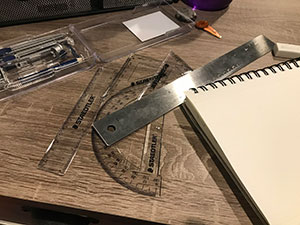 Now, I didn't get too fancy with my first attempt at lettering, but I did quickly find out that the best way to achieve symmetry and balance was to pull out any and all rulers I had and USE them. The idea in my head definitely turned out better 'in my head' but I'm not totally disappointed. Looking at it a little closer now that it is finished, I wish I would have exaggerated everything a bit more. The word FIRST could be stretched and center-squeezed more and the words MY and BLOG need an even greater rounded appearance (I also would have kept the dots off of those words and maybe added instead some expression lines?). I do feel that the HECK and YEAH turned out just as I would have liked and of the three fonts I like it the most (the last element added, of course it is my favorite!). On that note, here it is... 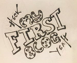 "I would make a font joke but I'm not bold enough." - punsandoneliners.com - Over the next 40 days I would like to delve into the world of hand lettering. I really enjoyed creating my own font and look forward to producing more designs that I can claim as my own. I also want to more deeply explore fonts and typography created throughout history, honing in on two of my favorite typographic styles...Art Deco and Baroque. My goal will be to take quotes, one-liners, quips, etc...and hand letter them into beautiful pieces of art. I feel that not only will this aide in broadening my knowledge of the world of fonts & typography in design, but that it will also be a delightful addition to my portfolio. Click on the button below to take a brief look back at two of my favorite typographic styles. Wow! Looking back 20 years at art doodles really helps in gaining perspective. Let's hope I up the ante this go around. ;) Not that what you see below is too terribly horrible, but...let's just say I've got a lot of room for re-discovery. |
AuthorHello! My name is Renee Marie Fraticelli. I am currently enrolled at Flathead Valley Community College . My course study is Graphic Design. I have just one semester left and couldn't be more excited to get out there and work in the field. Archives
March 2020
Categories |
 RSS Feed