|
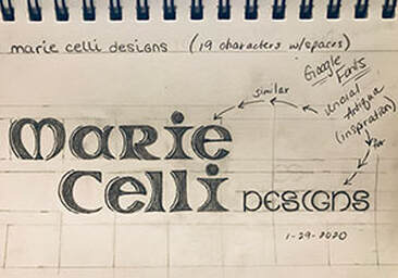
"Inspiration comes in many forms." Today I decided to begin working on a "look" that I feel represents me and my brand. I began by diving into an exercise my class mates and I had performed yesterday and really took a look at what I had written down and asked myself "what did it truly mean?" Well, to start, the first three words of my values were...Honesty, Inclusivity & Humor...then I think I was really hungry because my focus turned to doughnuts, but then I recalibrated and found that upon my reflection of just those few things I was able to begin to understand exactly who I am, doughnut distraction and all. So, what does this mean in the world of hand-lettering and how do I create something from those seemingly very different values? Here's what I came up with:  "Thank You!" Google Fonts & Designer, Astigmatic "Your font gets me and I was clearly inspired by it." Good thing it's not just a picture of me counting doughnuts to fall asleep, but oddly enough, the roundedness in the letters definitely makes me think of doughnuts...as I examine the design more, I can surely see Honesty in the subtle bits of straight lines, Inclusivity in the mimicking of shape in letters adjacent to one another, and Humor in the fact that, quite frankly, the "M" in Marie looks like butt cheeks. It's all good though, because as I am beginning to discover myself, I am also beginning to discover what that looks like pencil to paper.
0 Comments
Leave a Reply. |
AuthorHello! My name is Renee Marie Fraticelli. I am currently enrolled at Flathead Valley Community College . My course study is Graphic Design. I have just one semester left and couldn't be more excited to get out there and work in the field. Archives
March 2020
Categories |

 RSS Feed
