|
“Starting is not most people’s problem, staying, continuing and finishing is.” - Darren Hardy -
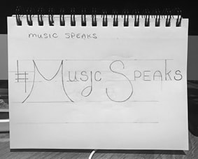
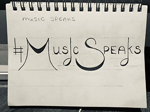
So, in case you may not have remembered, I had started this blog some days back with just a basic structure of the letters. I have now returned to it and added some finishing touches. I first changed the shape of the S, increased the line height of the music-note letters. I then darkened in and filled out the strokes of the letters to give them more dimension and structure. I like the look this particular font displays with its thick and thin strokes. The juxtaposition is subtle but definitely adds a little something. I'm finding that as I create different looks, I pull from this aesthetic a lot, a combo of thick and thin strokes. It's interesting to have worked enough now on some designs to recognize that and see what type of designer I am becoming. What a journey my mind has taken these last few weeks...
0 Comments
Leave a Reply. |
AuthorHello! My name is Renee Marie Fraticelli. I am currently enrolled at Flathead Valley Community College . My course study is Graphic Design. I have just one semester left and couldn't be more excited to get out there and work in the field. Archives
March 2020
Categories |
 RSS Feed