|
"When you have a dream that you can't let go of, trust your instincts and pursue it. But remember: Real dreams take work, They take patience, and sometimes they require you to dig down very deep. Be sure you're willing to do that." - Harvey Mackay -  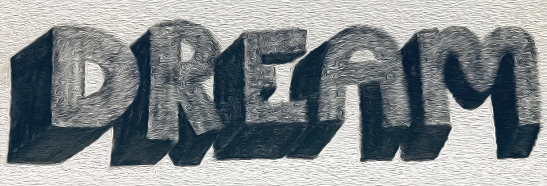 I opened this particular blog by wanting to delve into the extremely heartbreaking dream I had the other morning, but instead decided to flip it and turn it into a positive experience. I have realized that this pursuit of dedication to a blog has been a lot of work, patience and digging very deep within myself to pull out who I am as an artist and how I want to express that. Though I have not completely captured that idea, I have discovered a lot. I will continue to pull from these moments and continue to conceptualize myself as an artist...my life-long tale. P.S. I brought the above word into Photoshop and added a oil paint stylization to it making it appear more dream-like. Still having fun changing the dynamics of my hand-lettering.
0 Comments
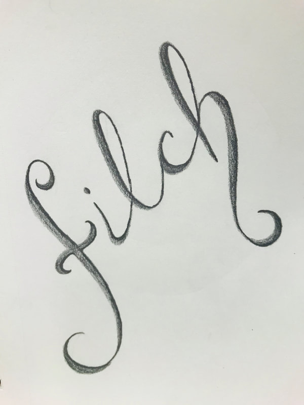
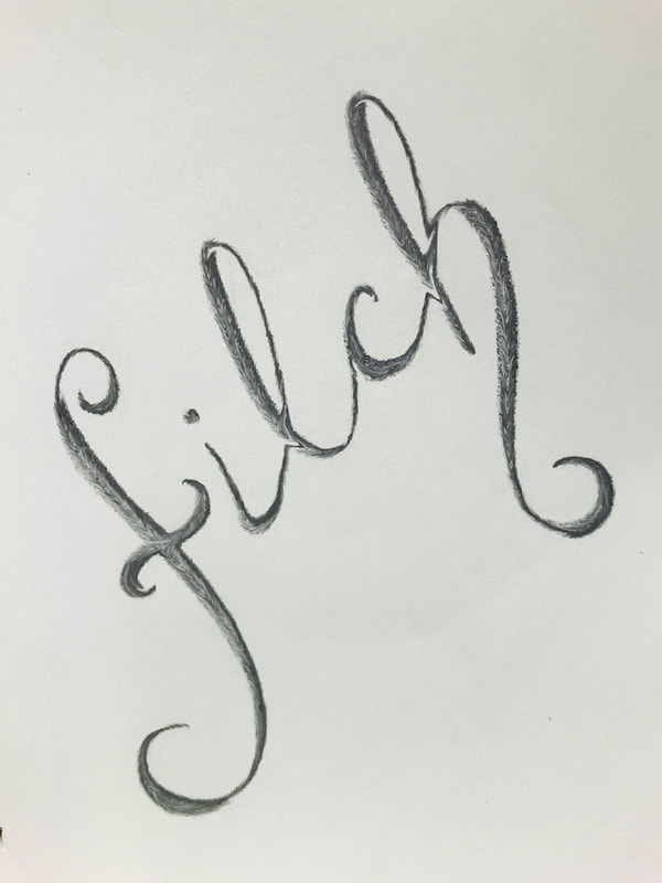
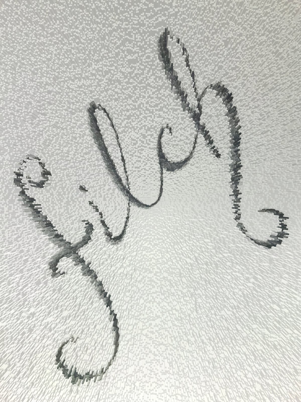
FILCH: to steal secretly or casually
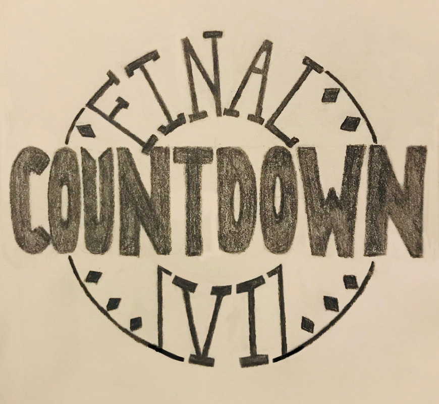
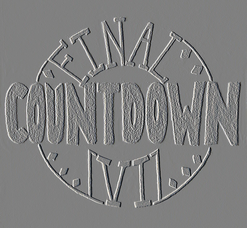
What a fun "word of the day!" Upon drawing it out I decided, once again, to bring it into photoshop and see what fun I could have with it...my favorite? the extruded filter. A super cool, speedy way to add texture and dimension to your lettering. I am going to add a bit more to this design and keep messing around with filters in photoshop. The experimentation is secretly stealing my heart. DID YOU KNOW?: Filch, as a noun, once referred to a hooked staff used by thieves to snatch articles out of windows and from similar places, but this use is now obsolete. "IT'S THE FINAL COUNTDOWN..." We all know that it is the final countdown (clearly my inspiration) to the end of this blog (at least for now) and I wanted to try a little something new. After creating my design I decided to bring it into photoshop and stylize it a bit. Now, I just added some embossing, but I think it looks cool. In my opinion, better than the original. It just gave it a "fresh" vibe that I'm pretty happy with. Of course, after reviewing the design for a bit I start to see all of the other places that I could take it, but that'll be good for now...just B, right?!?! :)
 Alrighty then! Had a nice critique today on my work so far in the graphic design program. I think I may be headed in the right direction. I finally just let myself operate the way I see things in the world and ya' know what? It worked! Thanks for pulling that one out mentors...you know who you are. So, my blog this evening is about just being. That is, "Just B" yourself. It can be as easy as that. What you create from that simple statement is going to be exactly what it needs to be and that, my friends, is nobody's to take away. "You are perfect exactly as you are. With all your flaws and problems, there's no need to change anything. All you need to change is the thought that you have to change." - J Cole - 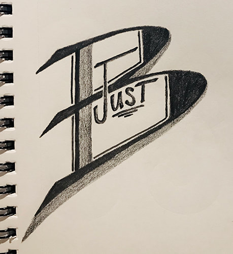 Today's design is not all hand lettering but rather a take on a "made-up" company logo. I had this idea some time ago and planned on digitizing it, thus allowing for further enhancement to the simple company name. Like, a little color, possibly a business card design?...mock-ups?...all to be determined at a later date. Fingers-crossed before the end of the semester so I can put it in my portfolio. I think it could make a nice spread.
|
AuthorHello! My name is Renee Marie Fraticelli. I am currently enrolled at Flathead Valley Community College . My course study is Graphic Design. I have just one semester left and couldn't be more excited to get out there and work in the field. Archives
March 2020
Categories |
 RSS Feed